 Today we’ll be talking a bit about the deep subject of color and color schemes.
The office is done … mostly … most of an entirely brand new computer, a new printer, bookshelf, desk … life is kind of back to normal. Our new house is coming along nicely due to Khristine’s hard work, though the girls ensure that it is always a mess and Karli’s decided that it’s really neat to take off her diaper and pee on the floor. Anyhow, I’d put this post off for a while when trying to get everything together and do some extra research, and then I’d lost it somewhere in the piles of boxes of (mostly garbage) treasures.
Monochrome
Monochrome is simply one color, sometimes with shades of. While somewhat boring, monochrome can be the boldest of the design world. For instance, a good logo should be recognizable in one single color, not even shades, it should stand alone and be interpreted to represent a company or brand through a graphic and a name. Something I often say is that if a logo doesn’t work in black and white, it doesn’t work at all. While I’m not really a logo designer (I’ve done a few), that same theory works with many advertisement designs as well. At The Reaper I’m bound to monochrome (black and white, or a gross version of grayscale) a good 80% of the time, when not, there is almost always photography or something to determine the color scheme of my work to some point … Also, with our printing capacity we’re pretty limited to what colors actually work. When I first started at the reaper I struggled a bit transitioning to the black and white world (I think there was some free advertising given just to cover my mistakes) but, now it’s kind of second nature.
Analogous
According to Merriam Webster
showing an analogy or a likeness that permits one to draw an analogy
Analogous color schemes can sometimes be a very safe route in design and … it is the using of a primary color, and neighboring colors on the color wheel. The results can sometimes be … boring.

I suppose if you’re familiar with our Reaper Wrap you could say that this is Analogous (with black). The reason for this is that we’re permitted to us only 3 plates for the wrap … one of those plates being black obviously … in CMYK using cyan and magenta we get purple, and derivatives in between.
The color of the wrap has been something that we’ve been experimenting with a bit for the last … year or so and it’s a once a month debate on what color it should be.
Sometimes, even when we shoot for a specific color, we get something a bit different. For instance, this May Wrap we wanted a light, springy sort of purple … and got this heavier more … saturated look. For Junes wrap, the shades of Orange that we decided on, printed much more red than I’d imagined.
Complementary
Complementary are colors opposite each other on the color wheel. Complementary color schemes carry the most contrast and have been said to cheapen a design when used poorly. People have different reactions to different colors for instance, blue for me is peaceful … calming, my wife doesn’t like blue … This could be because she is weird, it could be that she’s always grumpy so just prefers reds and blacks … I really can’t be sure. Green the color of spring renewal and hope; combined with it’s complementary red, can can be Christmas, stop, go, at the right shades; or a million other things to a million other people. Just remember to keep complementary schemes balanced, and by that I don’t mean cover your design equally in directly opposing colors. 😉


Triad
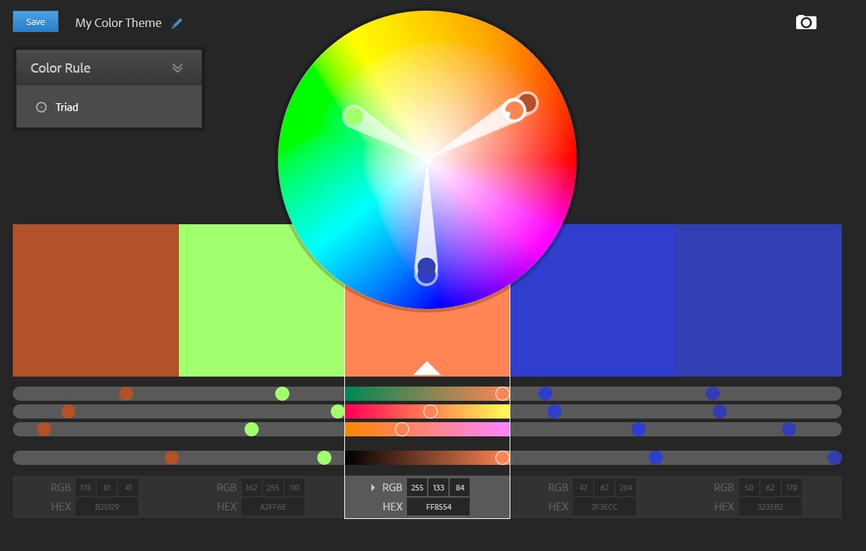
Triad color schemes are three colors equally distanced from each other on the color wheel, they are quite vibrant. For me triad can provide the most balance between busy, heavy contrast and cheapened designs. To be used successfully one color should dominate pretty heavily while the others are sprinkled for emphasis. Which generally works out well because I’ll pick out a dominant color in the graphic or photography being used and work around that.

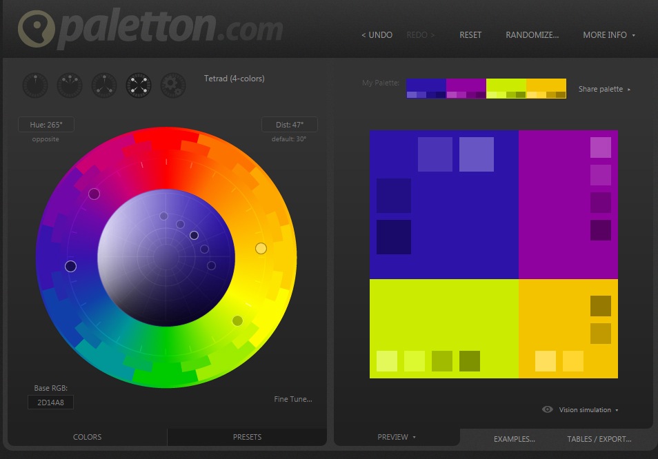
There are a million online tools available to help build color schemes for instance before discovering this Adobe one pictured above I would use the very nice tool available at paletton.com
Tetrad
I suppose I couldn’t finish without touching on the tetrad color scheme, sometimes referred to as square or rectangle, these are either 4 colors split equally apart on the color wheel (square), or a rectangle using two colors and their complementary colors. While tetrad schemes open up the door for a lot of variation in your design, it should be noted that this will also be the most busy scheme, and possibly have the heaviest contrast. To pull off a Tetrad color scheme, let one color dominate while using the other colors for emphasis. Used properly your design should carry a proper visual balance (as with any of the schemes) and not have the appearance of a pile of Skittles.

As noted above, no two people see a single color the same way, and each will have different emotional and psychological ties to any given color. There are though, some generalities that tie with each color:
- RED Courage, strength, warmth, energy, stimulation, masculinity, excitement.
- BLUE Intelligence, communication, trust, efficiency, serenity, duty, logic, coolness, reflection, calm.
- YELLOW Optimism, confidence, self-esteem, extraversion, emotional strength, friendliness, creativity.
- GREEN Harmony, balance, refreshment, universal love, rest, restoration, reassurance, environmental awareness, equilibrium, peace.
- VIOLET Spiritual awareness, containment, vision, luxury, authenticity, truth, quality.
- ORANGE Physical comfort, food, warmth, security, sensuality, passion, abundance, fun.
- PINK Physical tranquillity, nurture, warmth, femininity, love, sexuality, survival of the species.
- GREY Psychological neutrality, lack of confidence, dampness, depression, hibernation, lack of energy.
- BLACK Sophistication, glamour, security, emotional safety, efficiency, substance.
- WHITE Hygiene, sterility, clarity, purity, cleanness, simplicity, sophistication, efficiency.
- BROWN Seriousness, warmth, Nature, earthiness, reliability, support.
Now I’ve just skimmed the surface of color and the ways that I approach color in design. If you’re looking to explore more about color try
- Color Psychology: Profit From The Psychology of Color: Discover the Meaning and Effect of Colors
- The Secret Language of Color: Science, Nature, History, Culture, Beauty of Red, Orange, Yellow, Green, Blue, & Violet
- Color Persuasion: The Science of using Color to Persuade and Influence Purchasing Decisions
That’s all for today, If you liked this post be sure to follow me on your favorite social media channel, subscribe via e-mail and share, or all of them for that matter! Thank you for stopping in!
Sources:
https://www.colour-affects.co.uk/psychological-properties-of-colours.
