I love photography. I’ve enjoyed taking photographs since probably around High School/College time. I took a course at UVU (Then UVSC) called Digital Photography for Beginners. Which was amazing … I don’t recall if we were taught much about composition but, we did learn to use our cameras and it seems like one of the requirements was that we had to take like 2,000 shots over the course (a ridiculously low amount now but, seemed like a ton then) … I remember taking mini road trips with my friend Cody up the canyon, down the canyon … everywhere we could think of, (I don’t even remember where we went the one day to try and take some wildlife shots). Heber and the surrounding area had a ton of opportunity for great photography. Sadly, even though cameras were only 4-5 megapixel then, I don’t have any of the pictures to show. When the class ended I had to turn back in the rental camera (I believe it was a FujiFilm).
I went quite a while without a camera at that point, I got a nice consumer video camera to keep up with my (then baby) son (I was at a point in school that I was working heavily with video and audio also, this could have helped influence the camera choice), phones were starting to have cameras built in, later my ex-wife had I Nikon Coolpix that was amazing for birthdays and whatever so it really wasn’t the first thing on the agenda.

Seems like maybe Mother’s day 2011 or 2012 that my wife bought me a new camera, one with some manual settings and decent resolution. I loved it and was out taking pictures of kids, flowers and about anything that I could see. After some time I began to get frustrated with the amount of grain in my shots as well as the fact that it would go through batteries faster than … well, we’ll just say faster than anything.

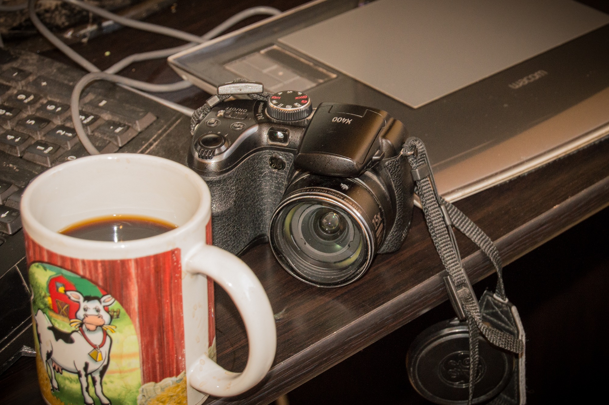
Fast-forwarding a bit … I frequent a ton of groups, if I were to guess a number I’d put it somewhere around 50 groups that I visit weekly (on Facebook, LinkedIn, and G+). I’ve got a handful of photography groups on Facebook that have been extremely helpful, supportive and engaging as well as design groups, business groups, illustration groups, blogging groups and well …. a bunch of groups. Though the wife let me upgrade to a Nikon D3200, this old GE can’t retire. I’ve found great little hands for it and it’s already paid off with some awesome, and sometimes hilarious photographs.
(I wanted to include links to the photography groups on Facebook, because the image below is from one of them, and I can’t remember which)
Symbiostockers (this one is more for people looking to sell their content, still very engaging and supportive group)

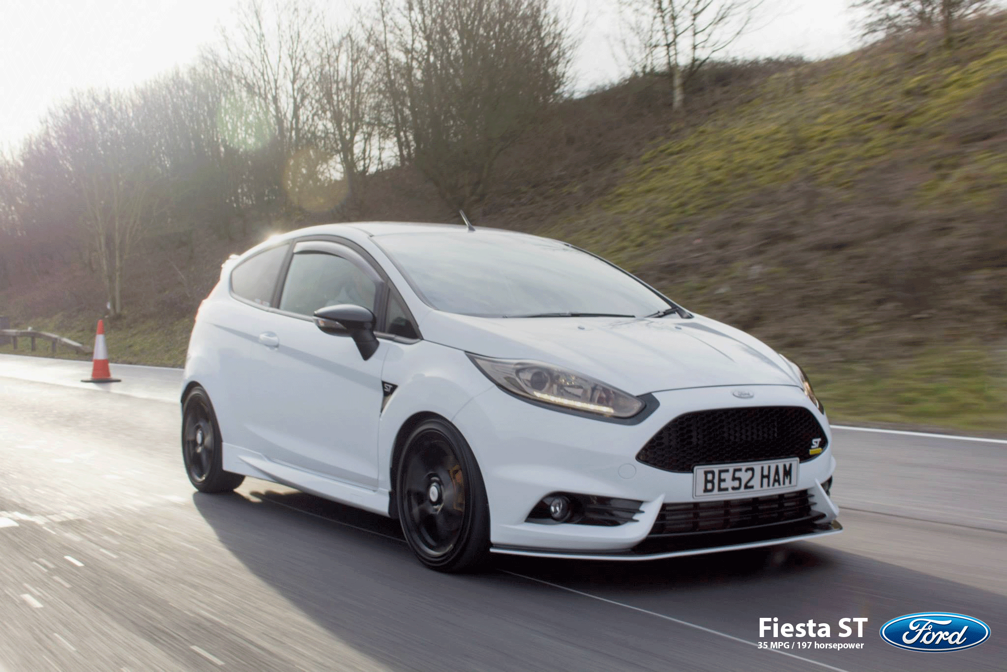
In one of the groups this image came across the feed, I think Nathan Holder was talking about how he had to hang out the window of his friends car, to shoot the other car … and that he wanted to try a longer shutterspeed. I thought it was awesome work and told him that it’s definitely something that you’d see in an advertisement. I toyed with the idea a minute and went to find the MPG’s (one of the things this car boasts) and whatever from Fords website and in fact found the exact same sort of image being used. Granted, the ford image was probably taken with a camera that costs as much as my new house … or it might be entirely rendered using computers and software (worth approximately the same amount) … It’s hard to say but, it brings up a fact about design. Great Design Starts with Great Imagery.


In fact, for many designers this is exactly the starting point. They say that a picture is worth a thousand words, and while … I know clients who would love to stick 1,000 words into a design, most I think understand that it isn’t going to be beneficial. I know that sometimes before I even start to break up a design task I’ll open my browser to our stock agency (Creative Outlet) and start looking for something that fits the theme. For smaller areas or spot colors I aim for an illustration but, a nice big photograph will make your designs much more … relatable, even better … a nice big photograph with people doing something will not only make your design more relatable, it will be personable. People look at these and subconsciously think, “that could be me” (sometimes it’s not even subconsciously). This Classic advertisement could have been significantly better, better images and less junk but, it illustrates a grid … and is an example of what I get to do.
I know that not all of us are designing advertisements, and we’re not all trying to shove products at consumers but, the same rule applies to logo design, poster design, billboards, album covers … and really everything that you see. In fact, even while reading this you are seeing design. Most of my favorite books have massive full page photographs and art sprinkled throughout. The best logos in the world have the perfect balance between graphic and text. These brands are so recognizable that after a time you don’t even need to see the logo, or only partially, to know their products and promotions.
There really aren’t many exceptions to this, unless you’re going for an extremely simplistic look. As a designer it’s your job to know when an image isn’t going to work, or isn’t fitting to the message but, most of the time. You’re going to be hunting for that perfect image that communicates your message, supports the theme, and fits the style.
Anyway, I suppose that’s all that I’ve got for today. Thank you for visiting!