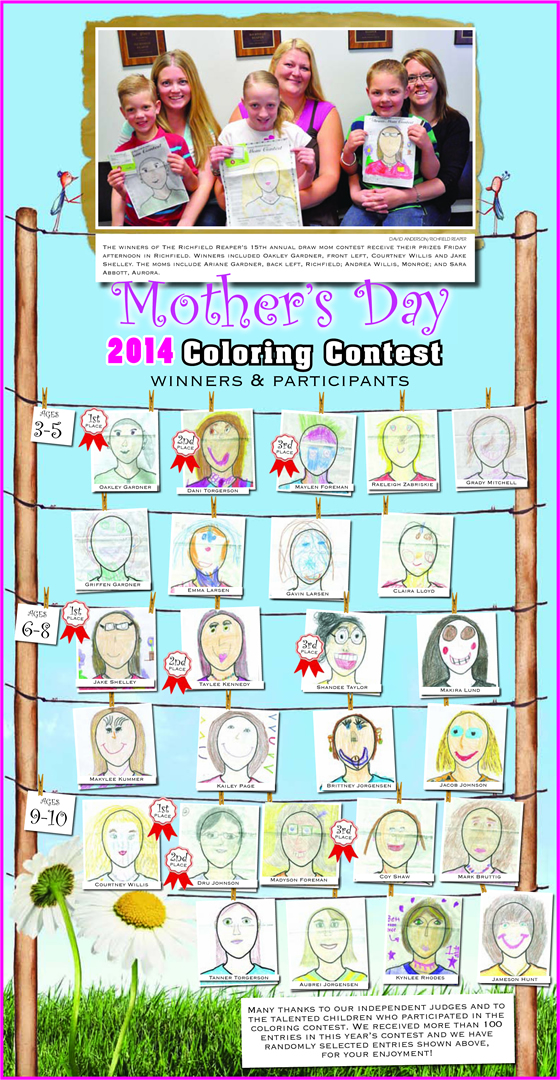
This and the Easter contest are so much fun. The kids get so excited and it’s always cool to see the winning pictures. It’s funny that some of the 3-5 year olds do just as well as the 9-10 year olds. It just shows how much attention to detail our little ones can have when they feel like they’re doing something important. I did put this years together but, it’s been the same design since before I worked at The Richfield Reaper, and rightfully so, it’s bright, colorful, and captures the mood of the contest.

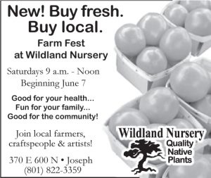
This is the only ad of mine I picked to share. I am happy that this weeks Wildland Nursery ad was big enough to include a photograph. In graphic design, people are more likely to connect with a photograph than an illustration or clip art. The advertisement size is a big challenge when trying to choose a piece of art to use. But, when I can I will almost always opt for a photograph. Besides, I like tomatoes.
Ummm … Oooops.Anyone who got the paper this week probably won’t even recognize this ad. Luckily, it was a house ad because, it ugh… The piece of art that was used, the great looking flourish you see pictured here, it was downloaded as an adobe pdf (I’m not sure if there were any other option) and it would have looked fine if it had been rasterized, downloaded in a different format or well … there are a million or’s … In fact, I went back and did some research and it would have been really hard to catch. Almost impossible with our current procedure. So, in it’s intended beauty, here’s your front page ad.

