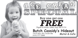
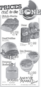
I was looking through last weeks advertisement designs today and noticed a theme, each one has the main graphic or headline integrated into the border. Thus tying together the advertisement as well as making the main idea instantly absorbable for the reader.

For Rotary International‘s “End Polio Now” trail ride I was going for almost a punkish exciting feel, narrow crop on the photos and information presented in boxes. I wish I could have gone with fewer boxes but, they had a lot of information to present.

This advertisement celebrating my friend Sandy Phillips‘ grand-babies birthday turned out well. I was playing with some font choices and decided on “Santa Fe” (I think, hope I’m correct there) gave them kind of a “Beach Boys” look, which fits the twin boys kissing in a swimming pool in this photograph. After getting the font down I realized that I needed to do something with the border. Since I was already in InDesign I just used white boxes and lines to create this beveled puzzle piece effect.
The rest of these advertisement designs I literally just made the graphic or headline part of the border or ad.

While I think that they’re all probably pretty effective, I think the Butch Cassidy’s Hideout ad is the most effective. That ad is about Ice Cream and you know it. Where the hell do you get the ice cream, well that’s obvious.

I think Andy’s Market would have been more effective with some better photos (and color ;). I might be looking too critically at it but, to me that hamburger is the heaviest thing on there … and that looks like a pretty good burger.
This post is part of a series of posts dedicated to getting my graphic design portfolio out of my desk and into the world. Want to start from the beginning?
