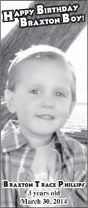
Only have a couple advertisment designs for this week. The birthday ad is for Sandy Phillips’ cute little grandson. I never understand how she gets her grandkids to actually sit and smile for photos. Any time my camera comes out my kids turn into retards.
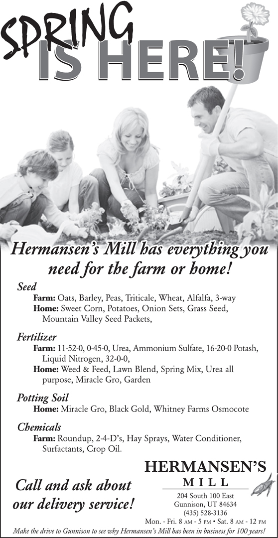
Hermansen’s Mill ad turned out just beautiful. They had a lot that they wanted to highlight here, and at first I was going to take most of it out. But, it worked out. They wanted to focus on the fact that they have what they need for the farmer, and the home gardener. Well, those are two different markets entirely … Pictures sell products, and including people makes that product personal. A picture of a farm, a tractor plowing a field or some crap would have certainly appealed to a farmer. But, the goal was to make it personal enough to appeal and catch the attention of both. I think it worked.


This post is part of a series of posts dedicated to getting my graphic design portfolio out of my desk and into the world. Want to start from the beginning?
