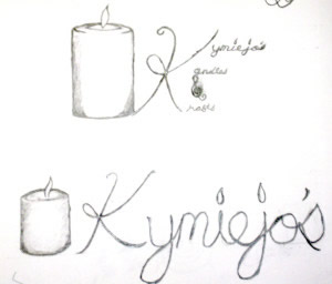
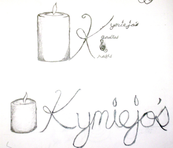
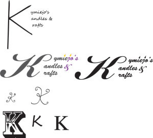
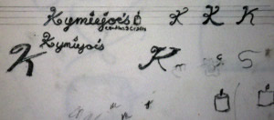
 Here are some rough ideas I’ve been working on today. I know you liked the squarer KKK (Kymie, Kandles, Krafts) version like the one you’re currently using but, I think to some people it could come off less professional (i.e. Candles, Crafts). So, it’s really up to you. I’m not sure who you’ll be trying to market to or whether you’ll be mostly using your logo on the web or in print, generally, more rectangular logos are more versatile than the squarish ones. But, it’s all a matter of what you plan to do. (On some of the ideas I accidently added an e after the o)
KymieJo’s Candles roughs


