Nothing much to report this week, a few more designs for the portfolio and updated the Best of the Best page with the 2014 results.
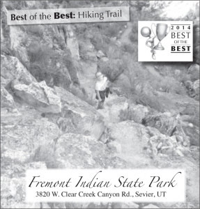
This design for Fremont Indian State park features a photograph of my niece on a trail there.
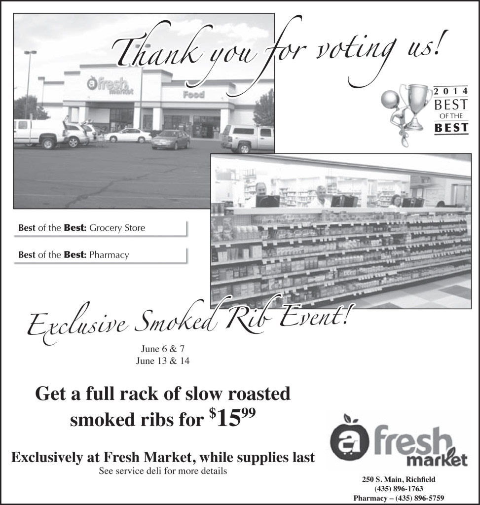
Fresh Market wins again. I think it would have been cool to feature the building maybe as the top border of the ad or something.
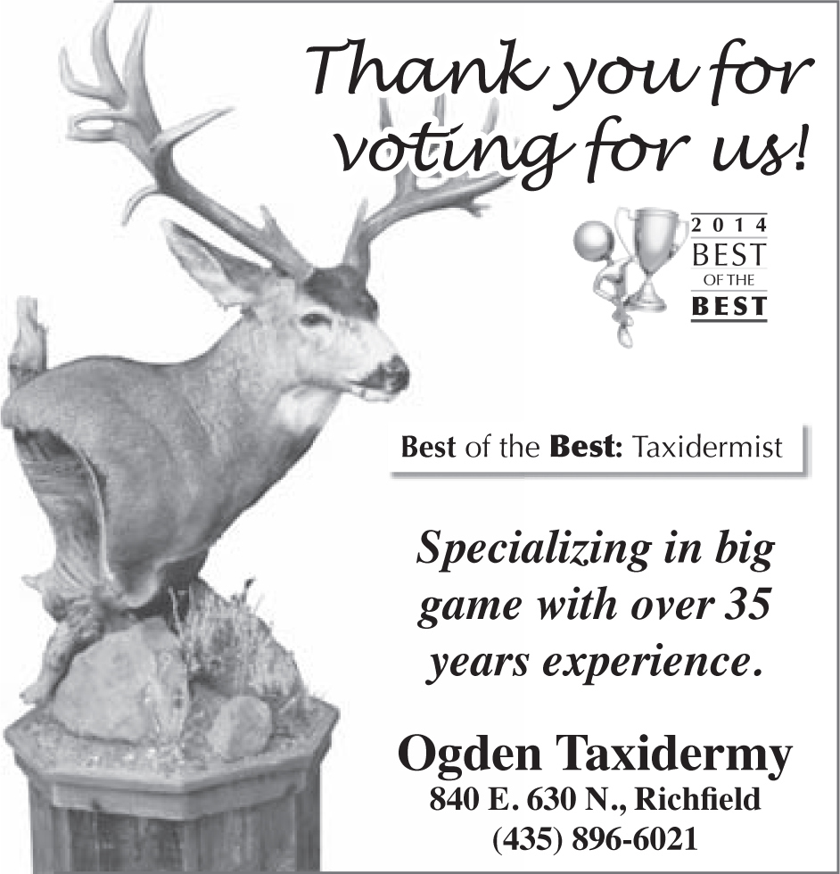
Anytime possible I isolate the photo that I’m using. Well, I should say anytime that it makes sense. Especially in grayscale it improves visibility, adds whitespace and draws attention to the graphic being featured. On this advertisement for Ogden Taxidermy the vertical shape of the photo also ads for a nice border.

I would have liked to do something different here, I don’t feel like this was an effective ad. It’s cluttered and the graphic is small.
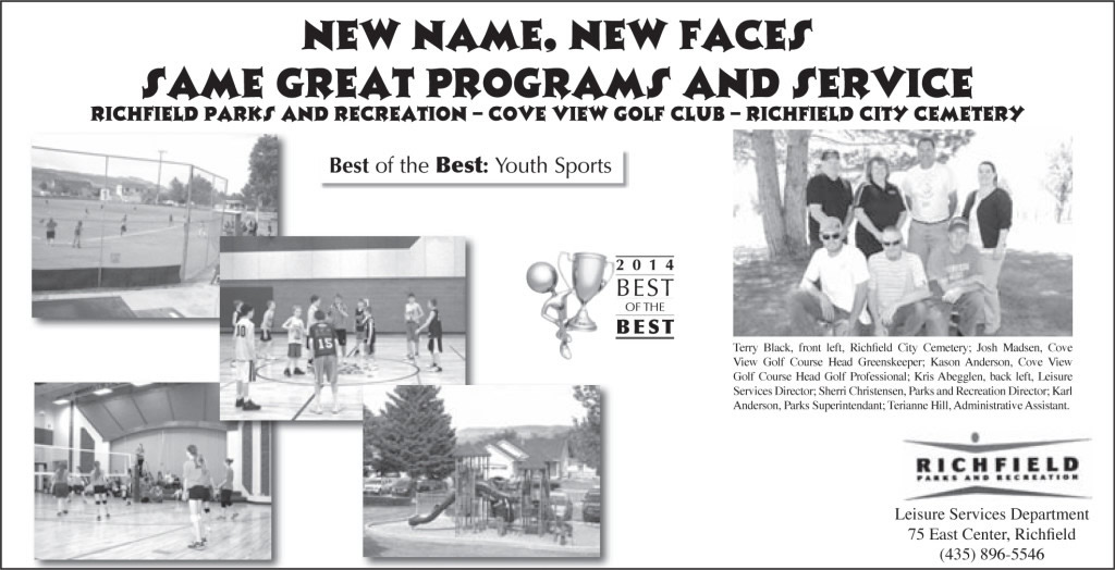
Again, cluttered …
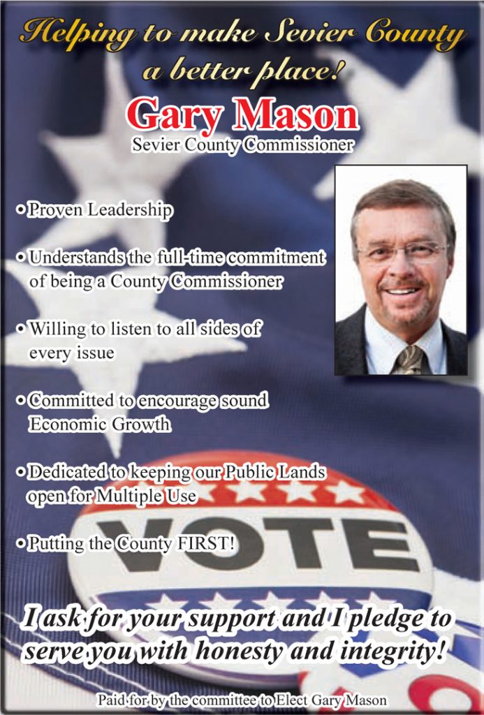
I was excited about this advertisement. I was a bit worried about the headline being dark. But, this printed badly anyhow. The separations didn’t align well enough to make it pop as much as I’d hoped.
This post is part of a series of posts dedicated to getting my graphic design portfolio out of my desk and into the world. Want to start from the beginning?
