Alrighty, more from 2012! I’m grouping 2 weeks together today since yesterdays post was so small. I try to stay pretty passionate about graphic design, going through these I think is helping me be a little bit more involved and subjective. Seems like it helps to go back and look at these old ads


The design for Bug Out I I had a business card I was basing it off of. Seems like the top portion I scanned in, and then I typed all of the smaller stuff. I ended up redesigning this a few months later to remove their logo and make it look “more professional”. I suppose we’ll get to that ad eventually.
The SR Mechanical design is pretty terrible, I agree. One of the difficult parts with their ads is that there’s very little art for A/C units on our subscription service. I’m sure we’ll see a ton of revisions as I continue.
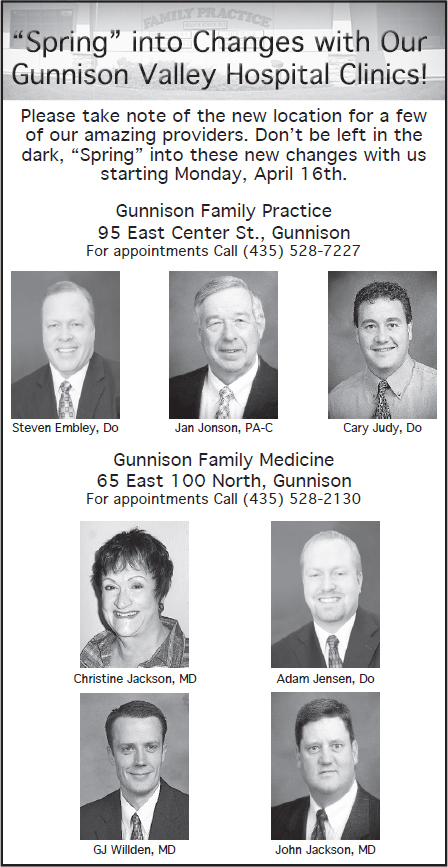
One of the most difficult things about graphic design is getting everything the client wants to say into one ad. This Gunnison Valley Hospital ad I think couldn’t have ended up much better for having the 7 mugshots while communicating their “spring” idea. Now looking back of course, there are quite a few things I would improve on.
Thanks for stopping by everyone! Remember to check back tomorrow!
This post is part of a series of posts dedicated to getting my graphic design portfolio out of my desk and into the world. Want to start from the beginning?